There are hundreds of tips in the world of online advertising. Justin Brooke has a great list that is worth checking out!
He makes various important points, such as:
- Leveraging in-market audiences.
- Pinpointing where ads are performing best and sticking to these platforms.
- Making sure to filter out bots.
Our favorite point is a pattern we have also found to be true, which is: don’t make your ads look like ads.
Brooke brings up a term called the “banner blindness” phenomenon, which refers to people’s tendency to ignore ads. Ads are very easy to recognize, they all seem to follow a specific set of characteristics. We encourage you to check out our article on the Instagram Effect on ads to further dive into this topic. Since they are so recognizable, people are tired of seeing the same ads everywhere they look! We have subconsciously learned to ignore advertisements.
For this reason, you should make a conscious effort to make your ads stand out from the rest. By not making your ads look like ads people will be more drawn to them. Playing around with “ugly ads” may be the right way to go.
Brooke points out that instead of making your ads by following the typical formula, you should try to model them as if they were a featured post on a website. The goal is to make the ads “blend in but stand out (in the right way).”
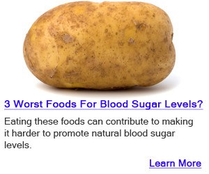
He added a photo of one of his best performing ads. What was the ad? A picture of a potato with text that made it look like something straight out of a Google search.

So, what is notable about this ad?
The first thing is that the ad is ugly, it’s not your typical Instagram model or a carefully arranged dish that makes the food look almost fake. The image is simple and ugly, and it definitely calls for your attention.
The second thing is that it doesn’t look like an ad at all. It seems like an image with your typical contextual links included in an article. The third point also has to do with this, and it is that the text is linkbait-y. By the format of the ad, you know that clicking on the text will allow you to get more information on this bizarre photo.
Finally, the ad is effective because it has a clear call to action. Do you want to know more about this potato? Well, click on this underlined link and you can learn more, problem solved!
One thing that the ad doesn’t do is focusing on cool branding.
So, we can draw some conclusions from here. Just because something looks good, doesn’t mean that it will be effective! So, experimenting with uglier ads that have viral article-type content is worth it.
It is important to mention that you have to make sure the context in which you use these ads is appropriate. Because ugly ads will most likely not fit into every single online advertising scenario.
What’s also interesting is that this article is two years old! Have consumers’ visual standards gone up in these last two years? The only way to find out is to test, test, test!
PS: We encourage you to check out the other excellent tips mentioned in the article, you might want to try them out!


