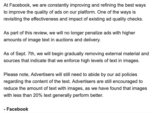
Big news from Facebook: Apparently, they’ve removed the famous (infamous) 20% text limit:

While the above message was sent privately (apparently; not to me!), it is also mentioned on their official help pages.
So, I have to admit: this 20% rule has pained me over the years. In many ways.
First, I’ve had too many ads come close to or pass that limit and be rejected. Dealing with it has wasted too many hours.
Secondly, it’s a point I’ve always had to train designers on–and sometimes, even build it into systems.
Third, without good ways to measure it officially–albeit some websites where you can manually upload the images and they would guesstimate the percentage–that added another frustrating step to the process of creating ads.
So we can all rejoice it is gone!
Or can we?
Here’s the downside. Remember G.K. Chesteron’s observation–“GK,” as I enjoy calling him, inspired by Ludwig Von–that you should never remove a fence without understanding why it was put up in the first place.
The elegance of that law was it avoided a lot of the cheesy ads that you see on, well, most programmatic sites.
Said differently: companies, advertisers, and conversion marketers (like myself!) love ugly ads, because they often work well, and we’ll do what works, so long as it is within an acceptable legal and moral framework.
But that’s about the only people or groups who like them. They make the Internet ugly more often than not.
Who hasn’t complained about these blinking, flashing, moving ads that make you want to go away?
This rule was one of Facebook’s ways of minimizing those sorts of ads and trying to keep Facebook classy.
But the times they are a’changin’ and Facebook is growing from “classy” to “klassy.”
Now, Facebook–no longer a startup but a FAANG industry giant–needs to hit its bottom line and prioritizes less cute legacy concepts like having a good looking Internet.
This move, in other words, surprises no one. Other than surprising me that it took this long. I’m cynical enough where I would have expected Facebook to have uglified their site like this in search of more revenue a few years before they did.


