
It isn’t often that you come across a display ad that rouses your interest and makes you wonder about the product it’s promoting. More often than not, the display ads we see online are for mundane products. In such cases, it’s easy to see why ad-makers have to go the extra mile to make their ads stand out from those of competitors.
On most days, when I check my social media accounts, I come across ads that are generic at best and forgettable at worst. On one such lazy Sunday afternoon, as I was actively avoiding the latest trending Reels on Instagram, I found this ad:
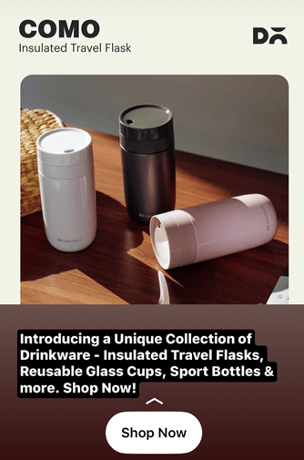
Now, I’m not one to spend an undue amount of time on ads for products I require…said no one ever. So, of course, I spent a few seconds perusing this ad for insulated travel flasks. Now, I don’t recall looking for, speaking of, or even thinking about flasks, so I’m at a loss regarding how it showed up on my feed.
So, what’s up with Instagram ads? With Google’s ever-updating privacy policies, it’s difficult to say. However, one thing’s for certain, the targeting of this ad was way off. I might have clicked on the inviting ‘Shop Now’ button just to check out the price of these flasks, but I doubt I’d have purchased one right away.
So, as far as the click-through rate (CTR) goes, I can see why this ad would score a few points. But, it’s not fair to say the same for its conversion rate, because I had no intention of buying the product. Anyway, let’s move on from the placement of the ad for a second and talk about its overall design.
The first thing that stands out regarding the graphic design aspect of the ad is its muted, neutral color palette. Did you notice how the flasks blend in with their surroundings because of the muted tones used throughout? There are three colors of flasks featured in the ad, and neither one of them are brightly-colored.
Besides, since the background colors are neutral, there’s nothing particularly eye-catching about the ad itself. So, unless you’re looking for flasks or have an interest in daily objects like these, it’s unlikely that you’ll find this ad appealing. However, this isn’t necessarily a bad thing.
Ads that feature bright or outlandish colors are often seen as flashy, which isn’t always a good thing. Sure, some people prefer their drinkware and other household objects in bright colors. However, in most cases, you’ll find ads for drinkware that’s in muted colors.
Therefore, there’s a sizable audience for ads that are for simple, practical daily objects, even if the entire audience won’t stop and stare at a simple ad like this one. If you think about it, though, there are a few aspects of this ad that show it’s not all that simple. For instance, the clever use of shadows in the ad to highlight the products displayed is admirable.
The shot of the flasks basking partially in the sun and hiding partially in shadows is meant to make users think of lazy afternoons and swigs of hot beverages. Also, the wicker basket featured towards the top left corner of the frame is reminiscent of summer picnics.
All in all, even though the ad might feature muted colors, it’s rich in visual detail. Another way to put this is that the ad conveys the essence of the product without relying on too many words for the same. It, therefore, ticks some major boxes here because after all, that’s what display ads are popular for in the first place.
Now, coming to the written portion of the ad, this isn’t all that bad either. Lately, I’ve been seeing plenty of ads on Instagram and other social media platforms that contain several typing and grammatical errors. Since PPC experts are often in a hurry to stay on trend and churn out ads by the dozens, this isn’t very surprising.
However, it was pleasing to find that there were no discernible errors in the written text featured in this ad. The lack of errors could be because there’s barely any text in the ad to begin with.
At the top of the page, it says ‘COMO Insulated Travel Flask’. So, that’s the brand name and a brief description of the product…so far, so good. On the top right of the page are what looks like the letters ‘DO’. Now, assuming COMO is the name of the brand, I have no idea what these letters stand for here.
However, they don’t take up too much space in the ad and aren’t particularly conspicuous, so it isn’t difficult to overlook them. Aside from the brand name and product description, there’s a little more written content in the ad. This content features a mention of the other products produced by the brand.
As you can see, it’s all drinkware. So, assuming a viewer has been looking for drinkware or similar objects online, they’d likely be interested in this collection of products. Initially, I thought the absence of any information on product pricing was a drawback of this ad.
However, after I dwelt on it for a minute, I realized this was a smart move on the PPC specialist’s part. Not mentioning the price of the flasks leaves viewers curious regarding the same and therefore prompts them to check out the brand’s website.
Also, the ‘Shop Now’ call to action is simplistic but effective.
To wrap things up, while there’s always space to improve a display ad, this one came pretty close to perfection. Keeping things simple in the world of display advertising is often more effective than you’d think.