So the other day I was going through my Instagram feed attempting to drown some post-Christmas blues (okay, the blues had nothing to do with it) and I came across a barrage of display ads that were related to planning for the New Year. Now, I wouldn’t say that I was looking for such planners online or anything because I truly wasn’t. But, since a lot of people that I interact with are interested in this sort of thing, I can honestly say that I wasn’t surprised to see these ads.
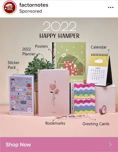
After all, everyone brings in January feeling highly motivated and in the right mindset to jot down their goals and aspirations for the year ahead. Long story short, even though I wasn’t looking for planning materials, journals, and the like online, I’m not surprised that I came across display ads on Instagram such as this one:

As you can see, it’s an ad from a brand called ‘factornotes’ that I’ve honestly never heard of. However, this doesn’t mean that it’s not a popular brand or that its products aren’t of good quality, it’s just that I don’t generally purchase stationery online so I wouldn’t necessarily be the target audience for such an ad. However, since it’s the start of a New Year and there’s another resurgence in the number of COVID cases out there, I might have considered purchasing some stationery for this year online; as I imagine would many other people.
I guess what I’m trying to get at here is that while the targeting of this ad wasn’t 100% accurate, it wasn’t too far off the mark either. Now that we’ve got that out of the way, let’s talk about the main elements of this display ad. First things first, can I just say how soothing the color palette is in this ad? What struck me instantly about this ad on first viewing is the rich blend of colors that are used here. There are soothing shades of green, lilac, lavender, pale yellow, and other muted colors that are featured in this ad.
These colors are rather easy on the eye and I’d go so far as to say that viewing them in the same frame while featured on different products makes for a very effective image. If I’m not one to purchase stationery online and this ad caught my attention for the color palette alone, then I can readily imagine that it had a more profound effect on those viewers that are accustomed to purchasing such products online and are looking for them.
Also, most ads that I came across on Instagram that were promoting planners and calendars like this one do seem to be saturated with information. For instance, I distinctly recall viewing an ad or two that mentioned how a brand ‘Could help you plan your year with these attractive new planners with different pages for meals plans, etc…’ Now, if you’re going to advertise a planner, most people – if not everyone – that views your ad are sure to know what a planner is and how they can use it.
So, filling your ad with too much information can divert attention from how your product looks, which is something that matters to more users than you probably realize. Think about it, anyone can take out a few minutes of their day to transform a plain notebook or journal into a planner. However, they choose to purchase these planners from stationery companies mainly for their aesthetic value.
Therefore, it’s an especially impressive feature of this ad that it allows the products featured in it to shine. Each product that’s in the image is distinctly identifiable from their images alone (although I’m not sure what the small flower pot is doing there). Even though these products are identifiable with the images alone, they’ve been clearly labeled as well. And I think this was quite a wise call on the part of the ad makers since I wouldn’t have been able to tell the sticker pack apart from the posters, would you?
Also, notice how (aside from the product labels) all the written content that’s featured in the ad is the line added right at the top that says ‘2022 Happy Hamper’? Notice how that’s all that was needed to convey what this ad was about and give us a clue regarding the kind of products that are featured in it? This brings us to what is perhaps a widely overlooked aspect of display advertising – keeping things simple. Why would you want to use lengthy sentences in your display ads when few words can do the trick?
Sure, there are times when memorable catchphrases and cleverly written taglines can make an impression on viewers. However, a skilled PPC individual would know when more words would be required to promote a particular product and when fewer words can get the job done more effectively. In this case, since the products in the ad are those that are trending and their images were easy to identify, it made perfect sense to keep the written content to a minimum. Granted, sometimes it’s useful to feature the price of your products in a display ad when you’re not using too much written content.
However, since this was an ad for stationery that isn’t very pricey, to begin with, it made sense to add only the names of the product here. All in all, this was one of the most simple yet well-designed display ads that I came across lately for several reasons. The most significant of these reasons was that it caught my attention even though I wasn’t its intended audience!


