Over the past year, I may have viewed more Display Ads than I have in the years since I started actively using the internet. I come across so many ads a day in and day out that I initially believed I was tuning these out subconsciously and only focusing on the content I wanted to view (Ad Fatigue much?), both for work and for entertainment purposes. However, with time I’ve realized that this isn’t true at all – I’ve been registering each ad I come across and have slowly developed a critical eye for these.
If you’ve been subjected to as many Display Ads as I have, you’ll know what I mean. It’s not just the visual aspects (such as the colors and graphics in general) of an ad that determine how effective or ineffective it is – it’s the graphics as well. For instance, as a content writer, the first thing I notice about an ad is the text, though I wouldn’t mind if this was accompanied by a stunning picture or great animation because, as we know, sometimes pictures are worth more than a thousand words. Therefore, today I’d like to discuss with you a Display Ad I came across while going through Instagram stories.
Those who use Instagram regularly will have noticed that the app displays ads after every few stories you view. These ads are based on your Google searches and more often than not, they are a form of re-advertising or re-marketing. Therefore, you could say that these ads are based on your interests and targeted towards specific audiences that are likely to respond well to them. However, in my case, I can’t say that this was strictly true.
Before we get started I’d like to mention here that I have nothing against this brand or the makers of this ad, all that I’ve written below are my personal observations and opinions on this ad.
Now, take a look at this ad:
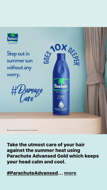
It’s an ad for Parachute Coconut Oil, a very popular brand in India. There’s an ancient tradition in India of deep conditioning your hair using coconut oil which is why this ad mainly focuses on the benefits this product has for your hair, as opposed to outlining the benefits of using coconut oil in general. The brand has used the color blue in all its ads (on television, the internet, and offline) for as long as I can remember so no surprises there with the choice of the color palette.
Since there’s nothing particularly striking about the colors used in this ad, my attention naturally turned towards the written content. Aside from what’s written in the main body of the ad, what caught my attention immediately was the #ParachuteAdvansed in the description box below. I have to say, I don’t have a particularly sharp eye for this sort of thing so if this stood out to me, it likely stood out to a lot of people.
This specific line stood out to me mainly because of the line spacing and the fact that it’s the last line of the ad. I recall my eyes widening a little incredulously upon reading it because of the obvious spelling error with the word ‘advanced’. The first thing I thought was that Parachute being such a popular and reputed brand for decades now has started to overestimate itself.
I mean, can’t a company that generates revenue of over 1 billion USD every year be bothered to hire someone to review the content of its ads or – at the very least – use spell check? I pondered over this for a few seconds then realized that ‘Advansed’ was the name given to this line of products from Parachute, it wasn’t a spelling error. And how did I figure this out? If you turn your attention to the top left corner of the ad, you’ll see it says ‘Parachute Advansed’ in really small writing.
I can only assume that scores of users like me who noticed the spelling error may not have noticed the same and run away with the impression that Parachute was slacking off on creating good ads to entice customers. Now that we have the would-be spelling error out of the way, let’s talk about the main body of content in the ad.
Firstly, the overall design of the ad is quite simple, featuring mostly blue in addition to some neutral colors. You’ll notice that the actual product is not placed in the middle of the ad, rather it’s placed slightly towards the right leaving more space on the left for written content. So if the makers of the ad decided not to feature the bottle in the center, you’d think that they’d have some worthwhile content to fill the space thus created, right?
Yeah, I thought so too, but I realized the line ‘Step out in summer sun without any worry’ just doesn’t cut it. I don’t mean to bash Parachute too much (I’ve been using its products since I was a kid) but surely a PPC expert could come up with a better line than that? This line sounds both generic and unimaginative, not to mention inadequate. Now, I know that by ‘without any worry’ they’re referring to the damage overexposure to sunlight can cause your hair. Let’s assume I didn’t know that or was unfamiliar with the brand altogether; would I then understand exactly what this line was trying to convey? Probably not.
The #DamageCare too seems redundant here since it could have been added in the description box instead of the main body of the ad. I genuinely believe this ad could have been more effective had it featured more meaningful written content in the main body rather than the description box. As for the visual content, I’d say it’s simple and effective and gets the job done of making users aware of what the product looks like.
All in all, it doesn’t take much to create meaningful and effective Display Ads – just keen attention to detail. If you’re not sure what will work for your Ad Campaign and what won’t, the key (as always) is to test.