More often than not when I come across a Display Ad online, my first instinct is to ignore it and skip ahead to reading or viewing the content I’m actually interested in. This, I believe, is the case with most people who spend more than 10 hours a day on the internet. Not only are most Display Ads generic and rather boring to view, but they can also be tiresome to go through all day long. Perhaps this is why PPC experts and graphic designers are in demand now more than ever, to help combat ad-related conditions such as banner blindness, which entails viewers simply ignoring display ads more out of habit than out of choice.
The easiest way to beat banner blindness is also the most obvious – make a good display ad. I know, I know, I say this is easy but in reality, it’s easier said than done, which is why marketing experts and enthusiasts alike take to the internet regularly to analyze the ads they come across in the process. I would gladly confess to being one such enthusiast and am here to share with you my analysis or review on a Display Ad I came across while scrolling down a news article.
The ad analysis posts I usually work on consist of mainly negative reviews on display ads (both static and video ads). Therefore, I thought I’d mix things up this time and review an ad that I believed ticked nearly all the right boxes concerning what a good display ad should be like. I’ll let you have a look at the ad before I dive right in:
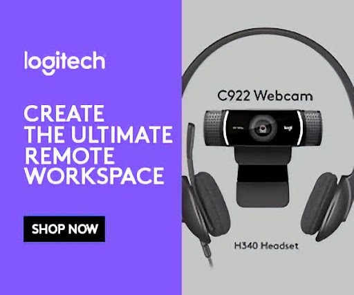
This is an ad for the electronics giant, Logitech. Now, I was recently looking for a pair of headphones to purchase online so I’m not surprised that I came across this one. After all, Google’s algorithm is almost eerie in its targeting accuracy. Now that we’ve established the targeting of this ad was on point, let’s take a closer look at the content featured in it. The first thing that struck me when I initially viewed the ad is its simplicity.
While most display ads that you’re likely to come across online are flashy and attention-grabbing, I often find myself drawn to those ads that are relatively toned down. In other words, ads that aren’t necessarily trying too hard end up making a deeper impression on viewers than their flashier counterparts do. So, whoever worked on the graphic design of this ad definitely knew what they were doing.
The colors used throughout the ad are mostly neutral, with half the ad featuring a splash of soothing blue. The overall effect of these colors together is quite easy on the eye, which is what makes it stand out from most ads you’ll see online that are a riot of colors that seem to be warring with each other. Besides, the simple colors allow the text on the ad to truly stand out and convey all relevant information to the viewer.
Speaking of text, the PPC expert who worked on the ad clearly wanted to play it down, keeping it in line with the graphic design used in the ad. The text consists of just one sentence ‘Create the ultimate remote workspace’. Because a large number of people are now working remotely in my hometown, I can see why the PPC specialist believed this sentence would be attention-grabbing. I mean, it certainly caught my attention and here we are!
Logitech has been at the top of its game for years now by identifying exactly what consumers would require of electronics to aid their day-to-day lives. Therefore, marketing a line of products as being perfect for a remote workspace would seem befitting of a company of this caliber for sure. After all, not everyone has all the right kind of equipment on hand to create the perfect workspace or workstation at home, even if they’ve been working remotely for a while.
I suppose what I’m trying to get at here is that even though this ad features just one sentence of promotional content, it manages to convey exactly what it’s meant to: that the company in question can provide customers with quality solutions to make their work-from-home experience more convenient. Now, the ad could have featured a larger chunk of text and elaborated on why Logitech products are so useful like I did above, but it didn’t. Why? Simple, it didn’t need to. It doesn’t take great knowledge or imagination to know what equipment you’d need to create a remote workspace.
Very likely the first thing that comes to your mind when you think of a remote workspace is a desktop computer or laptop, a pair of headphones, a webcam, a computer mouse, a box of tissues to soak up your tears that inevitably ooze out from having to work late…..you get the idea. Therefore, it makes sense that the makers of the ad chose to feature a headset and a webcam in the image. Another small but impressive detail in this ad is that the names of both products are mentioned in the ad in a font that’s quite easily legible. It’s always annoying when you see a great-looking product in an ad and then have to visit the brand’s website and compare products to the image of the product you saw in the ad simply because it wasn’t labeled in the ad!
All in all, this was by far one of the most effective ads I’ve come across lately. It was attention-grabbing yet simple, concise, and informative. If only more Display Ads followed the same rulebook that the maker(s) of this ad did, maybe banner blindness would be a thing of the past….if only!